Convolutional Neural Networks (CNNs) are a class of deep neural networks used for analyzing grid-like data. They are also known as ConvNets. CNNs have proven to be highly effective in areas such as image recognition and classification. In this article, we will breifly explore how CNNs work and how they can be visualized to gain insights into their inner workings.
#Contents
#What are Convolutional Neural Networks?
Convolutional Neural Networks (CNNs) are a type of deep learning model that is specifically designed to process structured multidimensional data, such as images. They are widely used in computer vision tasks such as image classification, object detection, and image segmentation. CNNs are designed to learn hierarchical representation of the input data.
#How CNNs Work
CNNs are composed of multiple layers, each of which performs a specific operation on the input data. The basic building blocks of a CNN are convolutional layers, pooling layers, and fully connected layers. Here is a brief overview of how CNNs work:
- Convolutional Layer: The convolutional layer applies a set of filters to the input data to extract features. Each filter is a small matrix that is convolved with the input data to produce a feature map. The filters are learned during the training process. We can visualize the filters as small images that highlight the patterns that the filter is looking for.
- Pooling Layer: The pooling layer reduces the spatial dimensions of the feature maps produced by the convolutional layer. This helps to reduce the computational complexity of the network and makes the model more robust to variations in the input data. Common pooling operations include max pooling and average pooling.
- Fully Connected Layer: The fully connected layer takes the output of the convolutional and pooling layers and applies a set of weights to produce the final output. This layer is similar to the hidden layers in a traditional neural network.
#Visualizing CNNs
Visualizing CNNs can provide insights into how the model is making predictions and help us understand what features the model is learning. We will be discussing two common visualization techniques: visualizing filters and visualizing feature maps. The code examples are written in Python using the popular deep learning library pytorch. We will be using the torchvision library to load and preprocess the data, and the matplotlib library to visualize the results. The models used in the examples are pre-trained models from the torchvision library that have been trained on the ImageNet dataset.
#Choosing a Pre-trained Model
To visualize a CNN, we first need to choose a pre-trained model. The torchvision library provides a collection of pre-trained models that have been trained on the ImageNet dataset. We can load a model using the torchvision.models module. For example, to load the AlexNet model, we can use the following code:
import torchvision.models as models
from torchsummary import summary

# Load the pre-trained AlexNet model
weights = models.AlexNet_Weights.DEFAULT
model = models.alexnet(weights=weights, progress=False).eval()

# Summarize the model architecture
summary(model, (3, 224, 224))
The summary function from the torchsummary library provides a summary of the model architecture, including the layers, output shapes, and the number of parameters in each layer.
----------------------------------------------------------------
        Layer (type)               Output Shape         Param #
================================================================
            Conv2d-1           [-1, 64, 55, 55]          23,296
              ReLU-2           [-1, 64, 55, 55]               0
         MaxPool2d-3           [-1, 64, 27, 27]               0
            Conv2d-4          [-1, 192, 27, 27]         307,392
              ReLU-5          [-1, 192, 27, 27]               0
         MaxPool2d-6          [-1, 192, 13, 13]               0
            Conv2d-7          [-1, 384, 13, 13]         663,936
              ReLU-8          [-1, 384, 13, 13]               0
            Conv2d-9          [-1, 256, 13, 13]         884,992
             ReLU-10          [-1, 256, 13, 13]               0
           Conv2d-11          [-1, 256, 13, 13]         590,080
             ReLU-12          [-1, 256, 13, 13]               0
        MaxPool2d-13            [-1, 256, 6, 6]               0
AdaptiveAvgPool2d-14            [-1, 256, 6, 6]               0
          Dropout-15                 [-1, 9216]               0
           Linear-16                 [-1, 4096]      37,752,832
             ReLU-17                 [-1, 4096]               0
          Dropout-18                 [-1, 4096]               0
           Linear-19                 [-1, 4096]      16,781,312
             ReLU-20                 [-1, 4096]               0
           Linear-21                 [-1, 1000]       4,097,000
================================================================
Total params: 61,100,840
Trainable params: 61,100,840
Non-trainable params: 0
----------------------------------------------------------------
Input size (MB): 0.57
Forward/backward pass size (MB): 8.38
Params size (MB): 233.08
Estimated Total Size (MB): 242.03
----------------------------------------------------------------#Visualizing Filters
Filters in a convolutional layer are small matrices that are convolved with the input data to extract features. We can visualize the filters as small images to understand what patterns the filters are looking for. For example, in an image classification task, the filters in the first convolutional layer might be looking for simple patterns such as edges and corners, while the filters in the later layers might be looking for more complex patterns such as textures and shapes.
To visualize the filters in a convolutional layer, we can extract the weights of the convolutional layer and plot them as images. The following code snippet shows how to visualize the filters in the first convolutional layer of the AlexNet model:
import matplotlib.pyplot as plt

# Get the weights of the first convolutional layer
weights = model.features[0].weight.data

# Normalize the weights to be in the range [0, 1]
weights = (weights - weights.min()) / (weights.max() - weights.min())

# Plot the filters as images
fig, axs = plt.subplots(8, 8, figsize=(8, 8))
for i in range(64):
    ax = axs[i // 8, i % 8]
    ax.imshow(weights[i].mean(dim=0).cpu().numpy(), cmap='gray')
    ax.axis('off')

plt.show()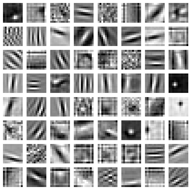
Each filter is visualized as a small image that highlights the patterns that the filter is looking for. The brighter regions in the image indicate the areas of the input data that activate the filter the most.
#Visualizing Feature Maps
Feature maps are the output of the convolutional layer after applying the filters to the input data. We can visualize the feature maps to understand what features the model is learning at each layer.
To visualize the feature maps in a convolutional layer, we can pass an input image through the model and extract the output of the desired layer.

The following code snippet shows how to visualize the feature maps in the first convolutional layer of the AlexNet model:
import torch
from torchvision import transforms
from PIL import Image

# Load an example image
image = Image.open('tiger-shark.jpeg')

# Preprocess the image
preprocess = transforms.Compose([
    transforms.Resize((224, 224)),
    transforms.ToTensor(),
])
input_tensor = preprocess(image).unsqueeze(0)

# Pass the input image through the model
with torch.no_grad():
    features = model.features(input_tensor)

# Plot the feature maps as images
fig, axs = plt.subplots(8, 8, figsize=(8, 8))

for i in range(64):
    ax = axs[i // 8, i % 8]
    ax.imshow(features[0, i].cpu().numpy(), cmap='gray')
    ax.axis('off')

plt.show()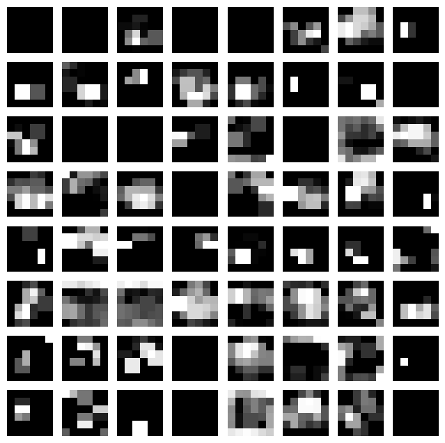
Each feature map is visualized as an image that highlights the patterns that the model is learning at each layer. The brighter regions in the image indicate the areas of the input data that activate the feature map the most. It is important to note that the feature maps are not interpretable by themselves, but they provide insights into what features the model is learning.
#Conclusion
We've explored how Convolutional Neural Networks (CNNs) work and how they can be visualized to gain insights into their inner workings. Visualizing CNNs can help us understand what features the model is learning and how it is making predictions. We discussed two common visualization techniques: visualizing filters and visualizing feature maps. By visualizing CNNs, we can gain a better understanding of how deep learning models process and analyze grid-like data such as images.